Home
Overview
Home is the entry point for viewing the dashboards created for each workspace.
When you first enter, the main dashboard set for each workspace is displayed, and you can move to the main dashboard of another workspace through the navigation sidebar.
What can you do?
Business/marketing users
- If you set key KPIs as the main dashboard, you can check today's status the moment you access Analytics.
- You can compare before-and-after performance immediately just by changing the date range to the campaign period.
- You can immediately extract the data you need to CSV and use it right away to write reports.
Data analysts
- You can build dashboards that suit each purpose for each workspace and quickly access frequently viewed dashboards with favorites.
- You can instantly apply the conditions you want, such as country, OS, and app version, as filters to see the current status at a glance.
Developers
- After deploying a new event, you can immediately check whether its data is correctly reflected in the dashboard panels.
Quick start
Basic view
- Click the Home menu in the left sidebar.
- In the navigation sidebar on the left, select the workspace to view.
- The main dashboard of that workspace is displayed automatically.
Change the date range
- Click a quick select button (such as Recent 7 days and Recent 30 days) at the top of the dashboard, or select dates directly.
- Click the Apply button to refresh the data of all panels.
Download data
CSV Download (except scorecards)
- Click the More (···) menu at the top of the widget panel to download.
- Click the data download button.
Image Download (except scorecards and tables)
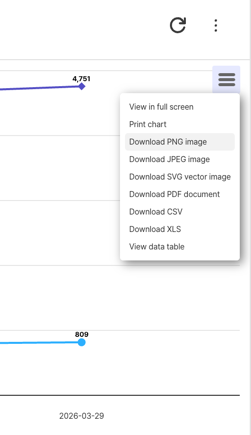
- Click the hamburger button shown on each chart.
- Click the image format you want (such as PNG, JPEG, and SVG).
Full features
Key concepts
| Concept | Description |
|---|---|
| Home Dashboard | The dashboard displayed by default when you enter Home. Specified in Workspace Management |
| Workspace | The unit space where content (charts, funnels, retention, dashboards) is stored |
| Panel | An individual chart or content item placed on a dashboard |
Built-in dashboard
Analytics provides a summary dashboard by default that you can use right away without any separate setup. When you first enter Home, this dashboard is displayed automatically, and you can check key metrics such as AU, revenue, and retention at a glance. 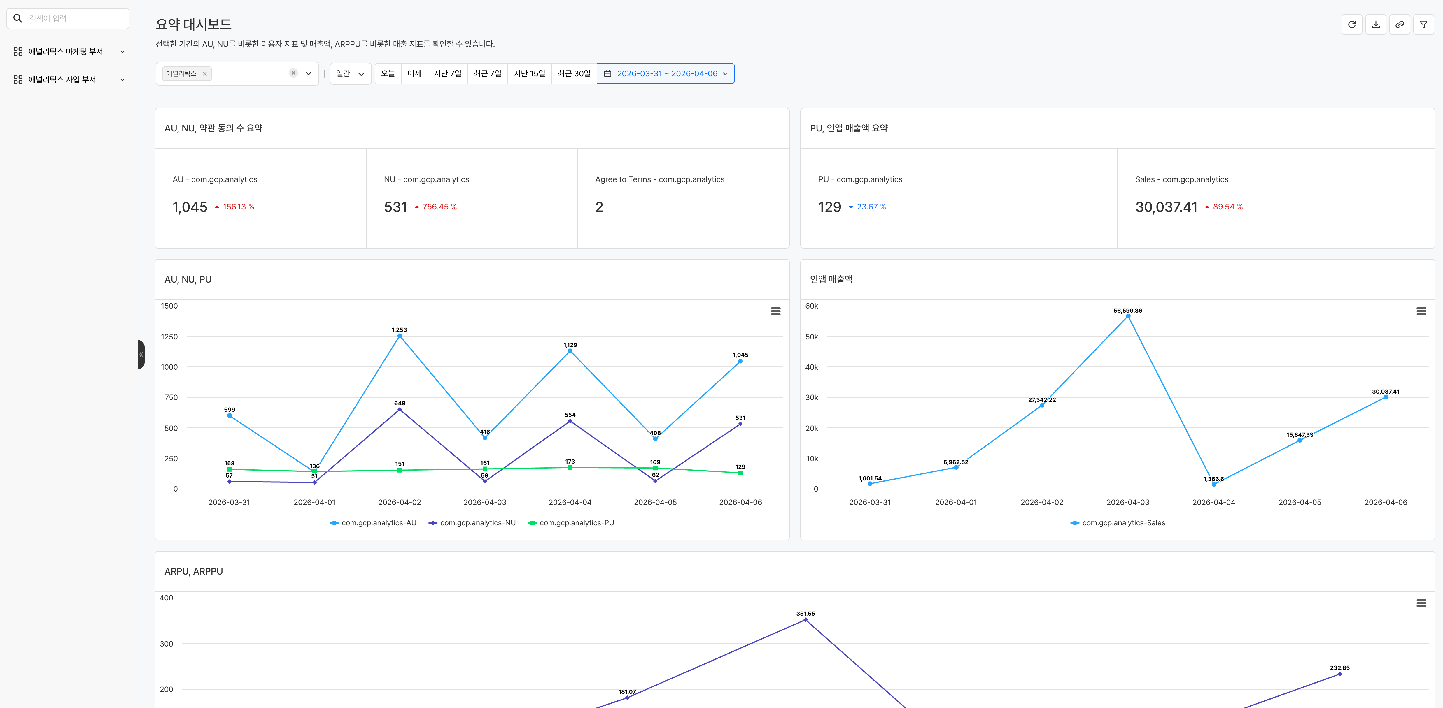
Key features
1. Browse dashboards

- Switch Workspace: In the navigation sidebar on the left, select a workspace you have access permission to.
2. Set the date range
Set the date range to apply to the whole dashboard.
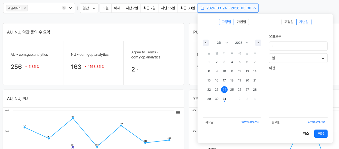
- Quick Select Buttons: Select a frequently used period, such as Recent 7 days or Recent 30 days, with a button click
- Select Dates Directly: Select the start date to the end date directly on the calendar
The Recent and Last quick select buttons work with different reference dates.
| Type | Reference date | Example |
|---|---|---|
| Recent N days | Calculated from today's date | Recent 7 days → 7 days including today |
| Last N days | Calculated from yesterday's date | Last 7 days → 7 days including yesterday |
The date input supports two methods: Fixed Date and Relative Date.
| Method | Description | Example |
|---|---|---|
| Fixed Date | The specified dates stay fixed. Always queries the same period regardless of when you query | 2025-01-01 ~ 2025-01-31 |
| Relative Date | Dates are calculated automatically based on the time of the query. Updated to the latest period every time you open the dashboard | Recent 7 days |
Note
When you change the date range, the data of all widgets in the dashboard is queried again for that period.
3. Visualization settings
Click the ... button on the right of each panel and then click the visualization settings button to view the chart data in various formats. 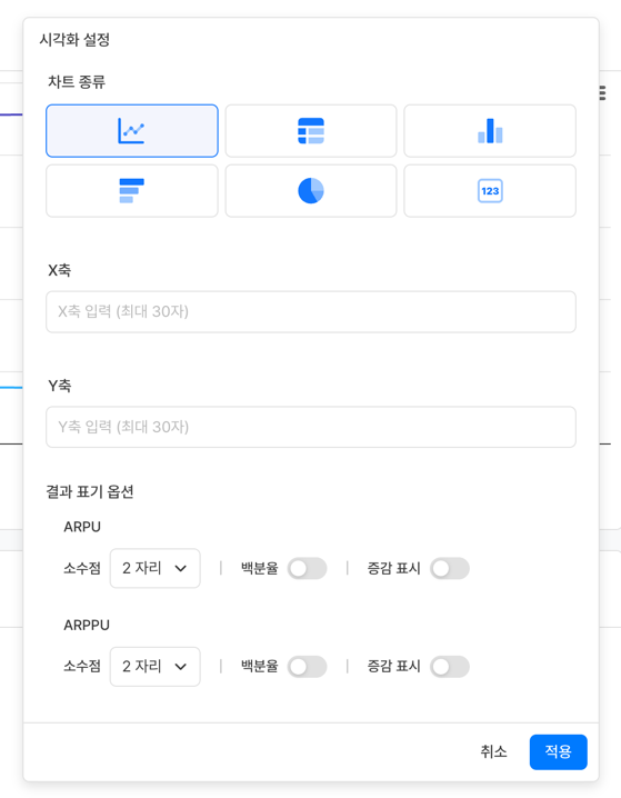
-
Chart types
Chart type Purpose Line Chart Suitable for checking time-series trends Bar Chart (Horizontal/Vertical) Suitable for comparing items Pie Chart Suitable for showing ratios Table Suitable for checking exact figures Scorecard Highlights a single key figure -
Result display options (applied when the chart type is Table)
- Decimal Places: Can be set up to 5 digits
- Percentage: Used to display percent (%) values
- Change Display: Used to highlight an increase or decrease
-
Currency options
- You can check metric figures converted to the currency set with the Currency settings feature.
- Currency options are shown only for measure values that use a money attribute set in Event when you create a chart.
4. Download data
If you want, you can download each panel or the whole dashboard and use it for analysis.
-
Panel
- Save the raw data as a CSV file (available when the chart type is not Scorecard)
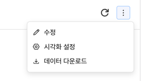
- Image: Save the chart as an image (available when the chart type is not Scorecard or Table)
-
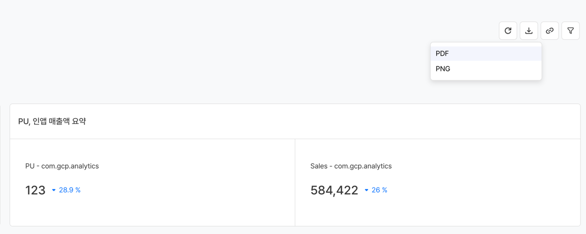
Dashboard: Save the whole dashboard as a PDF or PNG image file
5. Apply filters
You can apply dashboard-level filters to view only data that meets specific conditions. Filters are applied to all widgets in the dashboard at once. 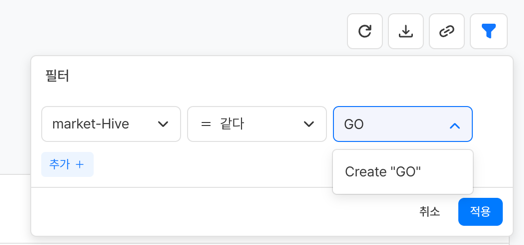
Note
The items shown in the dimension of a filter are the attributes of all the events used. If a specific event does not have that attribute, the filter is not applied to that event.
Notes & tips
- You can change the main dashboard displayed on Home in Settings > Workspace Management.
- If you do not have access permission to a workspace, you cannot view the dashboards of that workspace.
- Date range changes apply only to the current session, and the date range returns to the default value when you refresh the page.
Related menus
- Workspace management — Specify the main dashboard and manage workspaces
- Create a dashboard — When you want to create a dashboard yourself
- All content — View the list of all created content