Chart
Overview
Chart is a feature that automatically aggregates data and visualizes it as a graph or table when you select an event or metric and set the period and conditions.
You can create a chart by choosing the metrics you want.
What can you do?
Business/marketing users
- Visualize the daily trend of purchase completion events as a line chart to understand the effect of a campaign or event at a glance.
- Set country and OS as dimensions to instantly compare performance by region in a graph.
Data analysts
- Put multiple metrics, such as AU, ARPPU, and ARPU, on one chart for multidimensional analysis.
- Use segment filters to isolate and analyze specific cohorts only.
Developers
- After sending a new event, create a COUNT chart to immediately verify whether the data is received.
- Set event attributes as dimensions to check in a table chart whether the attribute values you sent are received correctly.
Quick start
If you are creating a chart for the first time, follow these steps to create your first chart.
- Click the Create button at the top and select Chart.
- At the top, select the workspace to save the chart in.
- On the [Settings] tab, set the project to analyze, the period (daily/weekly/monthly/hourly/minute), and the date range.
- On the [Data] tab, click the
+button to the right of the measure value and select an event or metric.- If you select an event, also select the aggregation method (COUNT, SUM, and so on) and the attribute to use for aggregation.
- Check the chart in the preview area on the right.
- Click the Save button at the bottom and enter the chart information.
Note
For detailed settings such as dimension values, filters, and visualization types, see Full features.
Full features
Key concepts
| Concept | Description |
|---|---|
| Measure Value | The target shown as figures on the chart. Select an event or metric and specify the aggregation method. |
| Dimension Value | The attribute used as the basis for grouping data. Example: viewing data by country or by OS |
| Aggregation Method | The method that determines how to calculate the selected attribute. COUNT, SUM, AVG, and so on |
| Period | The time unit for grouping data. Select from daily, weekly, monthly, hourly, or minute units |
| Filter | Sets only the data that meets specific conditions as the analysis target |
| Metric | A feature that saves frequently used metric settings so that you can reuse them in multiple charts |
[Settings] tab
Enter the basic information of the chart. 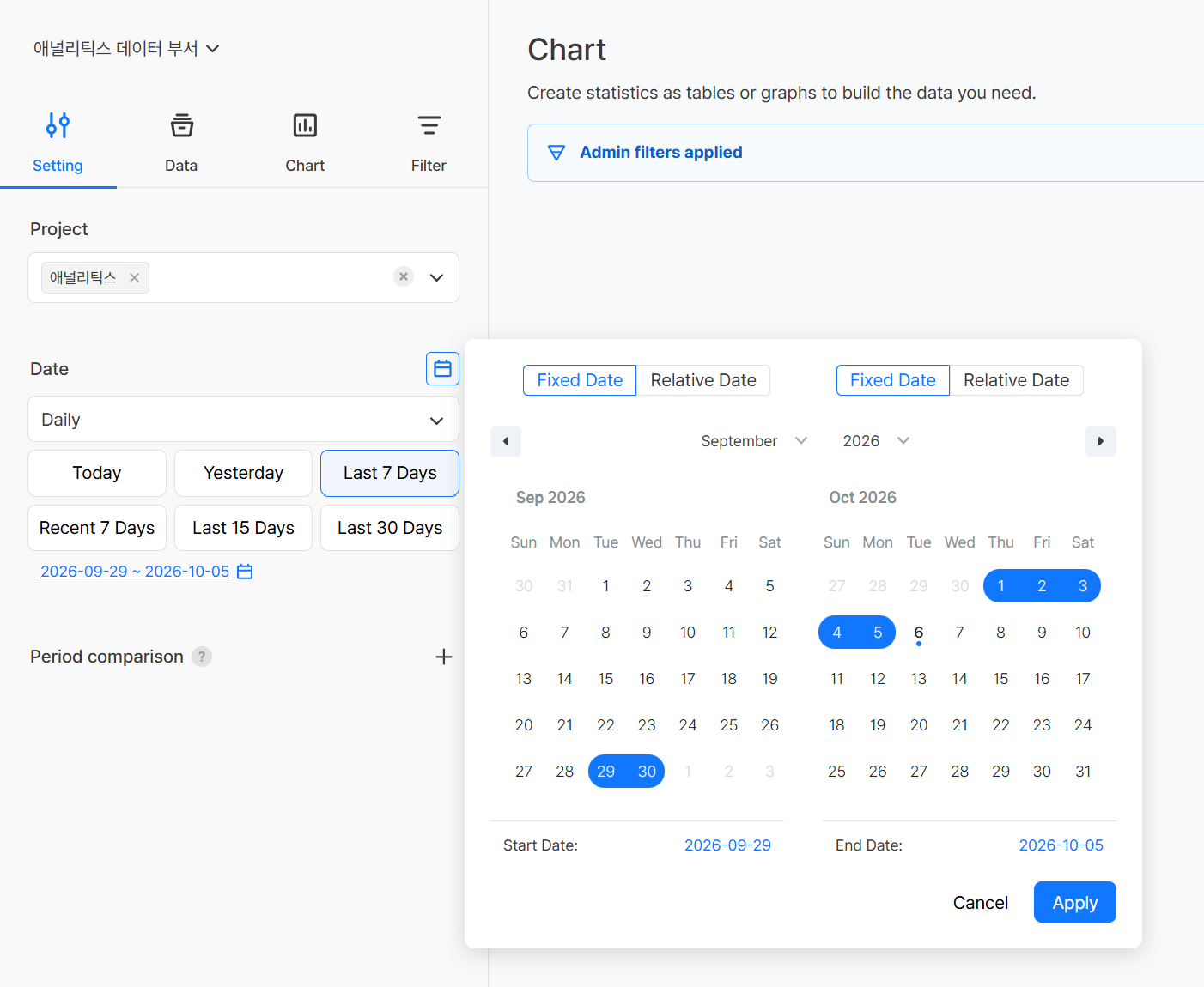
| Item | Required | Description |
|---|---|---|
| Project | Required | Select the apps to analyze (multiple selection supported) |
| Period | Required | Select the aggregation unit from 'daily/weekly/monthly/minute/hourly' |
| Date Range | Required | Select the start and end dates to analyze |
When you select a date range, you can use the quick select buttons or select dates directly with the calendar button.
In the calendar, you can set the start date and end date to Fixed Date or Relative Date respectively.
| Type | Description |
|---|---|
| Fixed Date | Fixed to the selected date. |
| Relative Date | Specifies how many days before today. The date range moves according to the date on which you view the chart. |
The Recent and Last quick select buttons use different reference dates.
| Type | Reference date | Example |
|---|---|---|
| Recent N days | Calculated based on today | Recent 7 days → 7 days including today |
| Last N days | Calculated based on yesterday | Last 7 days → 7 days including yesterday |
Period comparison
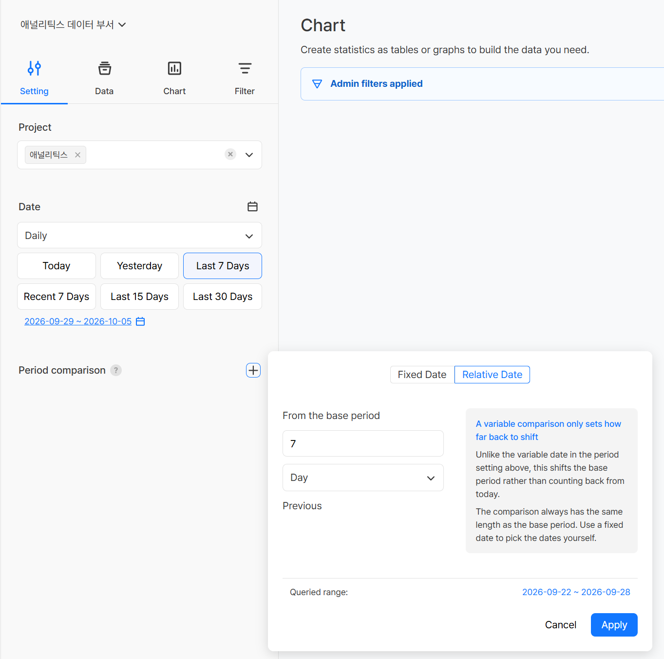
You can compare the figures of the selected date range (base period) with another past period (comparison period) in one chart. Click the + button to the right of Period comparison to add a comparison period.
| Method | Description |
|---|---|
| Relative Date | Specifies how far to shift back from the base period (example: 7 days previous). It is calculated from the base period, not from today, and the interval is kept even when the base period changes, so it is suitable for comparing with the same day of last week or the same point last month. |
| Fixed Date | Specifies the dates to compare directly. Even if the reference date changes, a specific point in time, such as an event start date or a date before an update, is kept as the comparison basis. |
- The comparison period always has the same length as the base period, and you can check the actual comparison period in Queried range at the bottom of the settings window.
- If you add multiple comparison periods, you can compare the base period with different past points at the same time.
- The comparison result is added as a
Measure name (compared)item, and you can check the base period figures, the comparison period figures, and the change rate together.
Example
If you set the date range to the last 7 days and add a relative date of 7 days previous, you can compare daily AU side by side with the AU of the same day last week.
Note
- Period comparison is available when the chart type on the [Chart] tab is Table, Vertical/Horizontal Bar Chart, or Line Chart.
- If there are many measure values or dimension values, the legend grows by the number of comparison items and the chart may become crowded.
[Data] tab
Set the measure values and dimension values to use for analysis.
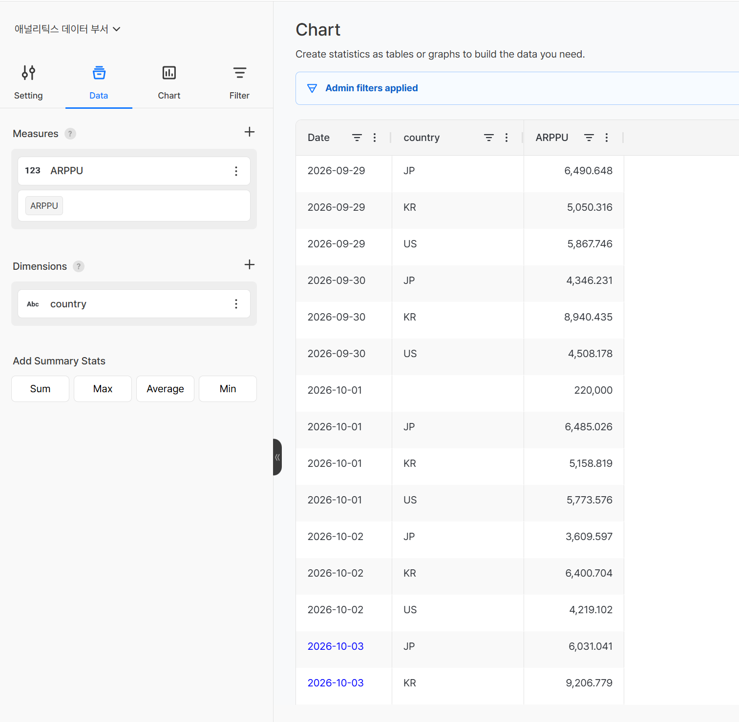
Set measure values
| Item | Description |
|---|---|
| Select Event/Metric | Select the event to analyze, or select a metric set in Data > Metric |
| Select Attribute | Select the attribute to use for aggregation (shown only when an event is selected) |
| Aggregation Method | Select how to aggregate the attribute (shown only when an event is selected) |
Aggregation Method Details
| Aggregation method | Meaning | Usage example |
|---|---|---|
| COUNT | Counts the number of times the event occurred. | When you want to check how many times the purchase button was clicked today |
| COUNT DISTINCT | Counts the number of unique attribute values, excluding duplicates. | When you want to check how many users actually accessed the app today (AU) |
| SUM | Calculates the total of all attribute values. | When you want to see the total payment amount for today |
| AVG | Calculates the average of the attribute values. | When you want to see how much one user paid on average |
| MIN | Gets the smallest attribute value. | When you want to check the lowest payment amount |
| MAX | Gets the largest attribute value. | When you want to check the highest payment amount |
| MAX BY | Gets the value of the most recent or last state. | When you want to check the last level a user recorded |
Rename measure values
Select Edit Name from the ⋮ menu of the measure value. You can specify the name displayed for a measure value. If you change it to an easy-to-recognize name instead of the original event or attribute name, the new name is reflected in the chart legend and the table header. When you change the name, it is displayed in the Changed Name(Original Name) format.
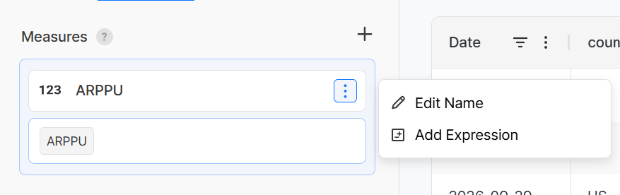
Example
ARPPU → Average Revenue Per Paying User(ARPPU)
Individual measure value filters
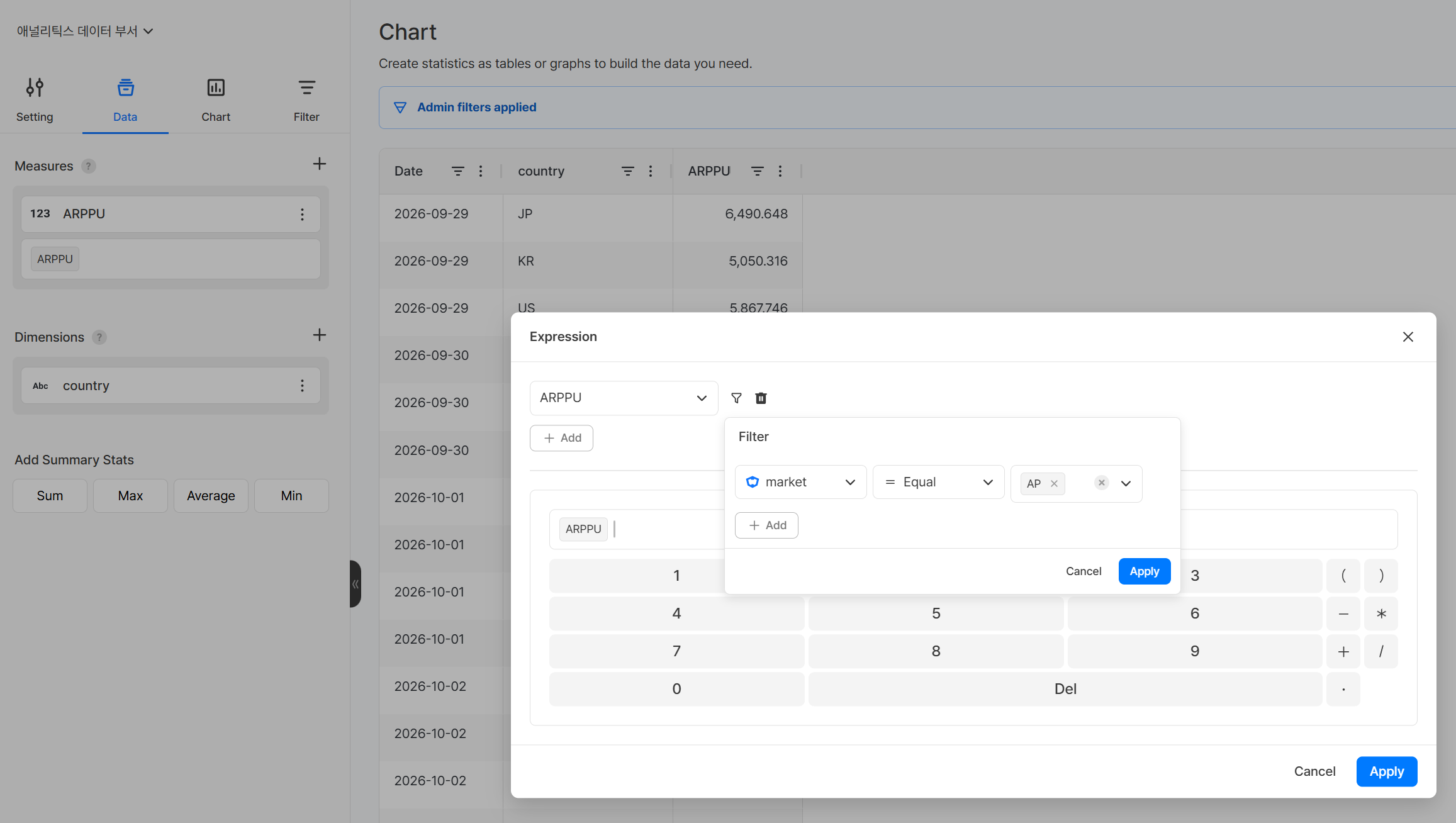
You can set separate filter conditions for each measure value. Unlike filters on the [Filter] tab, which apply to the entire chart, an individual measure value filter applies only to that measure value.
Select Add Expression from the ⋮ menu of the measure value, then click the filter icon to the right of the measure value in the Expression window to set the conditions.
You can add the same measure value to one chart multiple times, so feel free to apply filters in your analysis.
Example
To compare "purchase count of Korean users" and "purchase count of Japanese users" at the same time in one chart, add two measure values and set a different country filter for each.
Add measure value operations
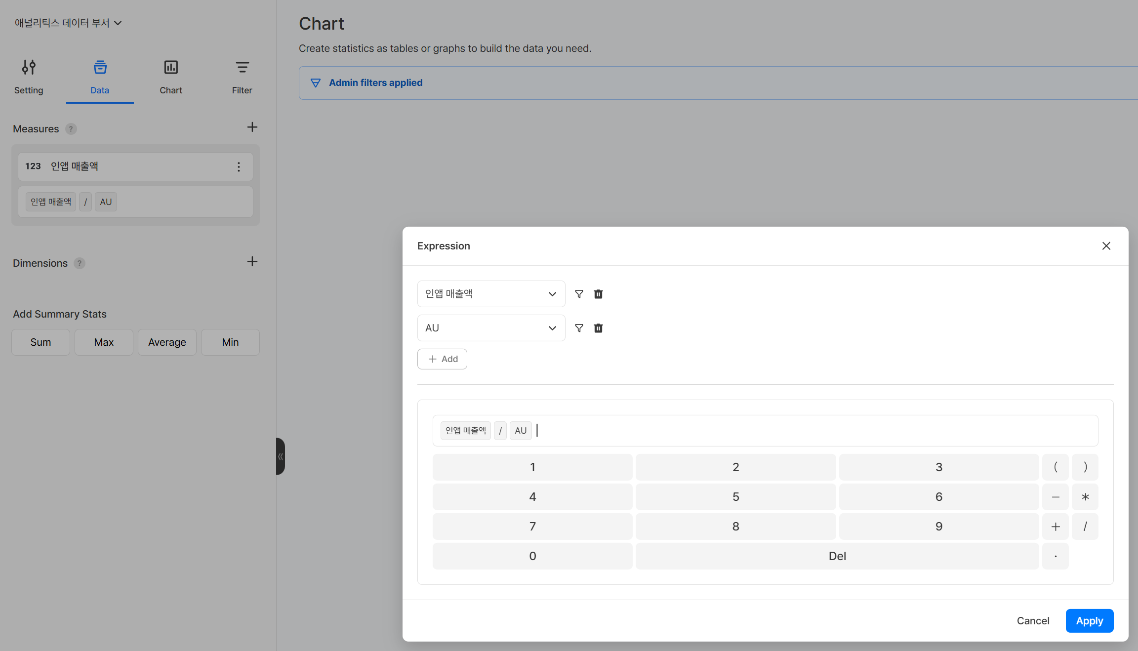
You can combine existing measure values with arithmetic operations to create new derived metrics. Example: in-app revenue / AU → ARPU
- Select Add Expression from the
⋮menu of the measure value. - In the Expression window, click the
+ Addbutton at the top to add the measure values to use in the formula. - In the input area at the bottom, combine measure values, numbers, arithmetic operators (
+,-,*,/), and parentheses to create a formula, and click Apply.
Warning
If the formula is invalid, the metric is not displayed on the chart. After you add an operation, make sure the value appears in the preview.
Rollup (secondary aggregation)
If you select an event as a measure value, you can set a rollup that first aggregates the attribute at a fixed time interval and then aggregates those results again by the period on the [Settings] tab (daily/weekly/monthly, and so on). Use it to check the maximum, minimum, average, or latest value of figures calculated at short time intervals.
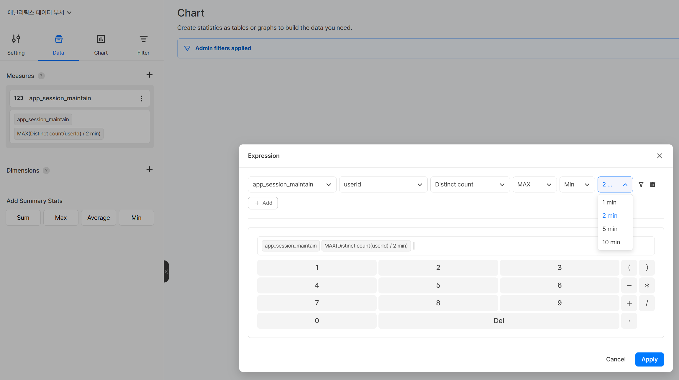
- Select Add Expression from the
⋮menu of the measure value. - In the Expression window, select the event, the attribute, and the first aggregation method.
- If needed, select the rollup method, the time unit, and the interval. Rollup is optional.
- Click Apply.
| Item | Description |
|---|---|
| First aggregation method | Method for aggregating the attribute at each interval (example: Distinct count) |
| Rollup method | Method for aggregating the first aggregation results again by the period on the [Settings] tab (optional) |
| Time unit / interval | Time interval for the first aggregation (example: Min / 2 min) |
Rollup method details
| Method | Meaning |
|---|---|
| MAX | Gets the largest value among the first aggregation results by interval. |
| MIN | Gets the smallest value among the first aggregation results by interval. |
| AVG | Calculates the average of the first aggregation results by interval. |
| LAST | Gets the latest value among the first aggregation results by interval. |
Example
Select the app_session_maintain event, the attribute userId, the first aggregation method Distinct count, the rollup MAX, and the interval 2 min, and set the period on the [Settings] tab to Daily. You can then check the daily maximum of the concurrent users counted every 2 minutes (daily peak concurrent users).
Note
In charts, you can set a rollup only when you select an event as a measure value. To apply a rollup to a metric, define the metric with a rollup in advance in Data > Metric and then select it in the chart.
Set dimension values
Set the basis for splitting the data.
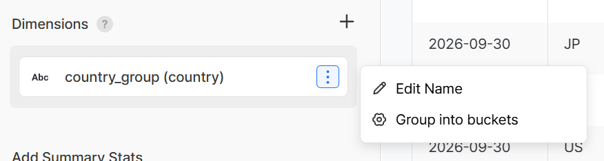
- Example: AU by country → set country (country) as the dimension
- If you add multiple dimensions, you can combine them in your analysis, such as by country & by market.
Note
The items shown in the dimension value are the attributes of all events used to create the measure values. If a specific event does not have the attribute, the value may be shown as '-' or 0.
Rename dimension values
Select Edit Name from the ⋮ menu of the dimension value. You can specify the name displayed for a dimension value. If you change it to an easy-to-recognize name instead of the original attribute name, the new name is reflected in the chart axes and legend. When you change the name, it is displayed in the Changed Name(Original Name) format.
Example
market → Market(market)
Group dimension values into buckets
You can group the original values of a selected dimension value into groups or numeric ranges and display them as a new dimension value. Use this to compare data by grouping countries into regions or dividing prices or levels into ranges, without changing the original data.
Select Group into buckets from the ⋮ menu of the dimension value.
| Method | Data type | Description |
|---|---|---|
| Group | Text, Number | Select one or more values to group them into one group, and specify the group name. |
| Buckets | Number | Enter a start value and an end value to divide a numeric range into buckets, and specify the bucket name. |
- Equal-width setup: For a number-type dimension value, enter the min, the max, and the number of buckets to automatically create buckets of equal width.
- Label for other values: Values not included in any group or bucket are grouped into one and displayed with the specified label.
- Groups and buckets together: If you set both a group and a bucket on a numeric dimension value, the group takes precedence.
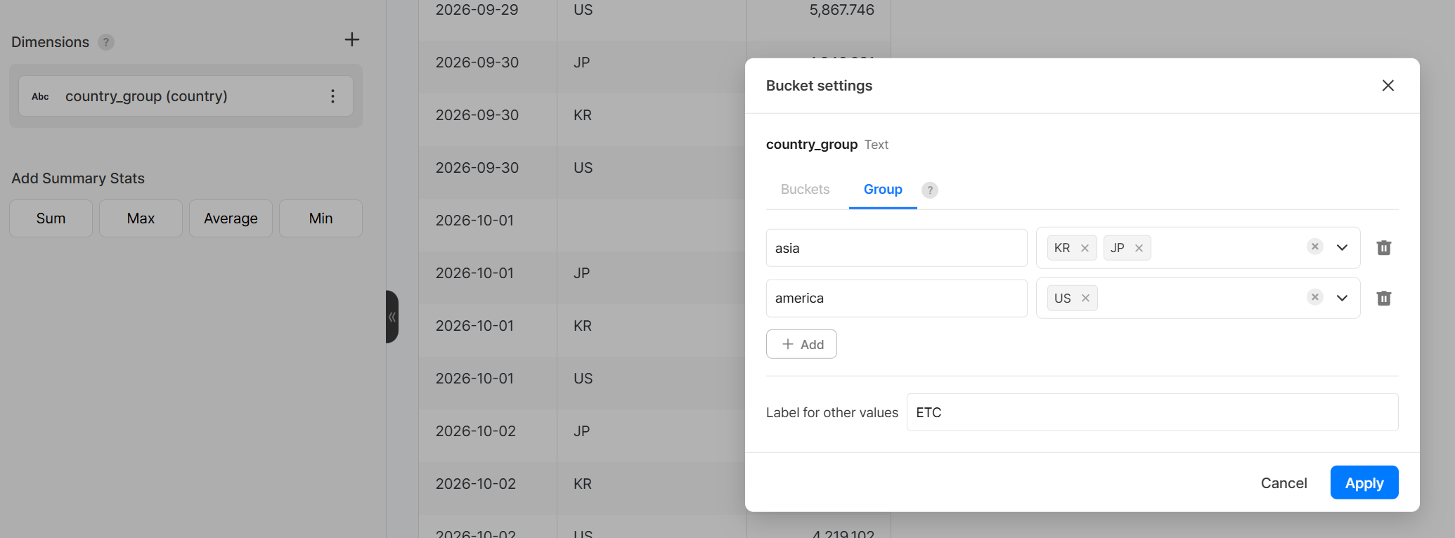
Example
- For the dimension value
country, groupKR,JP, andCNasAsiaandUSandCAasAmerica, and set the label for other values toETCto compare AU by region. - For the dimension value
price, enter the min0, the max100000, and4buckets in equal-width setup to create the buckets0~24999,25000~49999,50000~74999, and75000~100000and compare PU by price range.
Add summary statistics
If the chart type selected on the [Chart] tab is 'Table', this feature also displays the aggregate statistics for the entire selected period. You can check the statistical figures while viewing the trend.
| Statistic | Description |
|---|---|
| Total | The sum of all figures during the selected period |
| Average | The average of the figures during the selected period |
| Min | The lowest figure during the selected period |
| Max | The highest figure during the selected period |
[Filter] tab
Set filter conditions that apply to all measure values added to the chart. To set a condition for a specific measure value only, use the individual measure value filter on the [Data] tab.
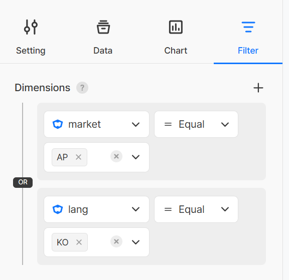
Select the filter target from Attribute and Segment.
Note
The items shown in the filter's dimension are the attributes of all events used to create the measure values. If a specific event does not have the attribute, the filter does not apply to that event.
Filter condition operators
| Operator | Description |
|---|---|
| Equals | Includes only data that exactly matches the entered value. Example: view only users whose country is "Korea" or "Japan" |
| Not Equals | Includes only data that does not match the entered value. Example: view only users whose OS is not "Android" or "PC" |
| Less Than or Equal | Includes data that is less than or equal to the entered value. Example: view only cases where the payment amount is 10,000 KRW or less |
| Greater Than or Equal | Includes data that is greater than or equal to the entered value. Example: view only users whose level is 50 or higher |
| Range | Includes data that falls between the two entered values. Example: view only cases where the payment amount is from 1,000 KRW to 10,000 KRW |
| No Value | Includes data where no value is recorded for the attribute. Example: view only users without country information |
| Has Value | Includes data where at least one value is recorded for the attribute. Example: view only users with country information |
Note
The Greater Than or Equal, Less Than or Equal, and Range operators are not shown when the attribute's data type is text.
- You can combine multiple filter conditions with the AND / OR operators.
- AND: Includes only data that meets both conditions. Example: a filter for data where the country is "Korea" and the payment amount is 10,000 KRW or more
- OR: Includes data that meets at least one of the two conditions. Example: a filter for data where the country is "Korea" or the country is "Japan"
Segment filter
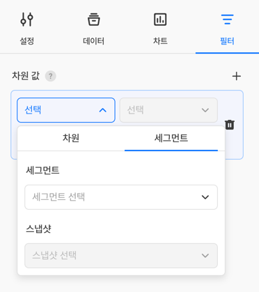
If you select a segment as a filter, only the data of users in that segment is reflected in the chart. Depending on how you combine the segment conditions, you can use it in two ways: Dynamic Cohort and Static Cohort.
| Method | Condition combination | Meaning |
|---|---|---|
| Dynamic Cohort | Select a segment only | Recalculates the segment conditions every time the chart is viewed and reflects the users who match the current conditions. When users enter or leave the segment conditions, the chart figures change automatically. |
| Static Cohort | Select a segment and a segment snapshot together | Fixed to the user list at the specific point in time when the segment snapshot was created. Even if user status changes later, the set of users reflected in the chart does not change. |
Tip
- To see the users who meet the conditions right now in real time → Dynamic Cohort (select a segment only)
- To fix and analyze the users as of a specific point in time, such as a campaign start date → Static Cohort (select a segment + snapshot)
For how to create segments and segment snapshots, see the Segment document.
[Chart] tab
Set the visualization method for displaying the data.
Chart type
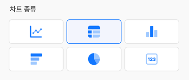
| Type | Main purpose |
|---|---|
| Line Chart | Shows the trend of changes in figures over time as a line. Suitable for viewing daily DAU or revenue trends. |
| Vertical Bar Chart | Compares figures by item with vertical bars. Suitable for comparing figures by country or OS side by side. |
| Horizontal Bar Chart | Compares figures by item with horizontal bars. Easier to read when there are many items or the names are long. |
| Pie Chart | Shows the proportion of each item in the whole as a circle. Suitable for checking OS or country proportions. |
| Table | Shows exact figures in table form. |
| Scorecard | Highlights a single key figure and compares it with the figures of the previous day, week, and month. Suitable for showing KPIs such as today's DAU and revenue at a glance compared with yesterday's figures. |
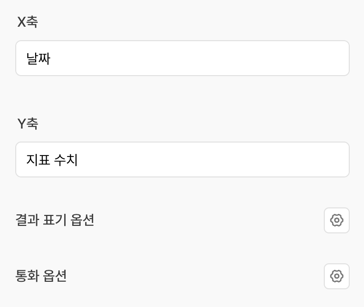
Detailed visualization settings
| Item | Description |
|---|---|
| X-axis Name | Enter the label text displayed on the X-axis. |
| Y-axis Name | Enter the label text displayed on the Y-axis. |
| Currency Option | Converts figures to a specific currency unit for display. Shown only when an attribute specified as a 'Money Attribute' in Data > Event is used in a measure value. |
| Result Display Options | Sets how the figures on the chart are displayed. You can combine the decimal places, change display, and percentage options. |
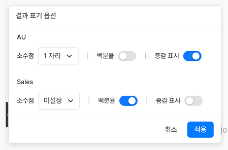
Result Display Options Details
| Option | Description |
|---|---|
| Decimal Places | Sets how many decimal places to display. Example: 2 decimal places → 1,234.56 |
| Change Display | Displays the change from the previous period with an arrow. Example: ▲ 12.3% (up from the previous period) |
| Percentage | Adds the % sign to the figure. Example: 13 → 13% |
Create a segment
If the chart type on the [Chart] tab is Table, you can select a measure value in the table to create a segment and a segment snapshot directly based on that data. You can turn the users you found in the chart into a segment without configuring separate conditions, and use them for further analysis.
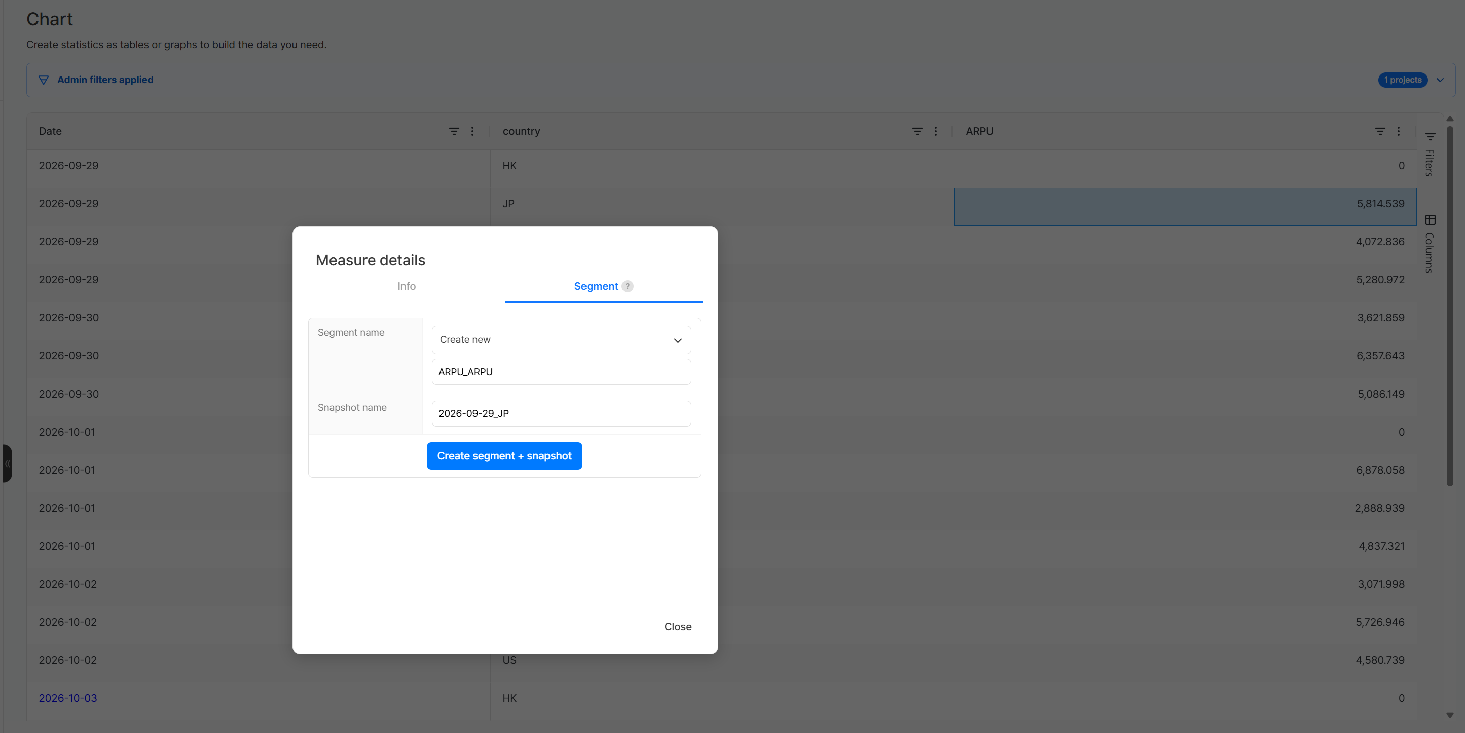
- Select a measure value in the table to turn into a segment.
- In the Measure details window, select the [Segment] tab.
- Enter the segment name and the snapshot name.
- Click the Create segment + snapshot button.
| Item | Description |
|---|---|
| Segment name | Select Create new and enter a new segment name. |
| Snapshot name | Enter the name of the segment snapshot to create. |
You can check the created segment and snapshot in the Segment menu.
Edit a chart
- In All Content, click the title of the chart to edit to go to the edit page.
- Change the settings on the tab you want.
- Click the Save button at the bottom.
Notes & tips
- You cannot save a chart without a measure value. Add at least one measure value.
- If you select multiple projects, the event data of all selected projects is summed and displayed. To view it separately by project, add
appIdGroupto the dimension values. COUNT DISTINCTis used to count unique users or devices without duplicates. It is useful for calculating AU.- Changing the chart type keeps the data settings. Try the same data in various chart types to find the form that shows it best.
- Table charts are useful for checking exact figures or validating data before you export it to CSV.
- Right-click the chart preview area and select Export to download the chart data as CSV.